Data Visualization
Data Visualization
I really enjoy producing data visulatization projects as I feel that it is a great intersection between design and data. I really enjoy the problem solving aspect of creating something that is visually appealing and memorable, while at the same time not losing the core message or creating opportunity for the data to be misinterpreted.
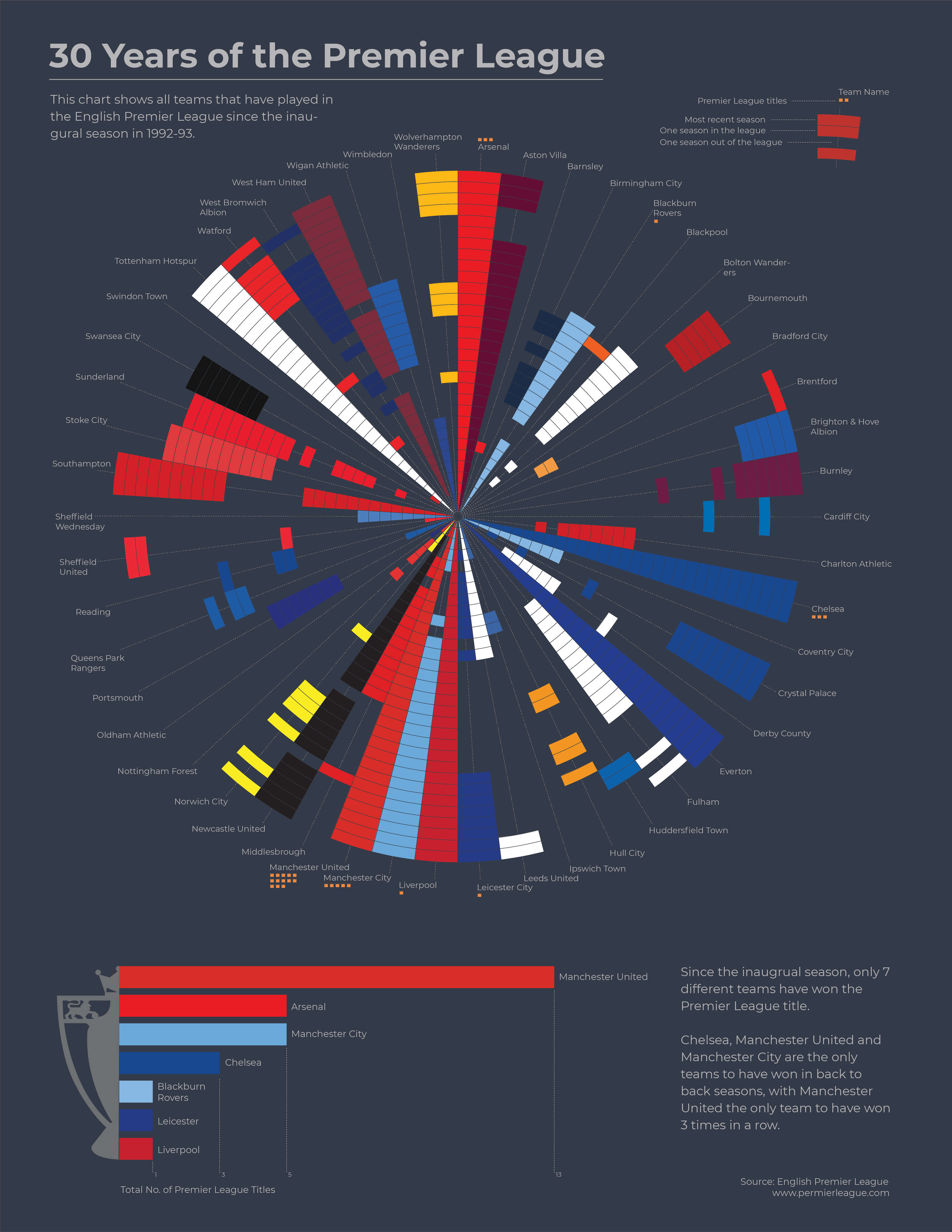
I created this visualization of 30 years of the English Premier League primarily to show how many different teams have at one point played in the league. I wanted to clearly show which teams had been in the league the most and which had dropped out then come back, and I think the spoke diagram works well for that. Each segment represents a season, and I also added details showing how many league wins each team has, as well as secondary bar chart showing the teams with the most wins.

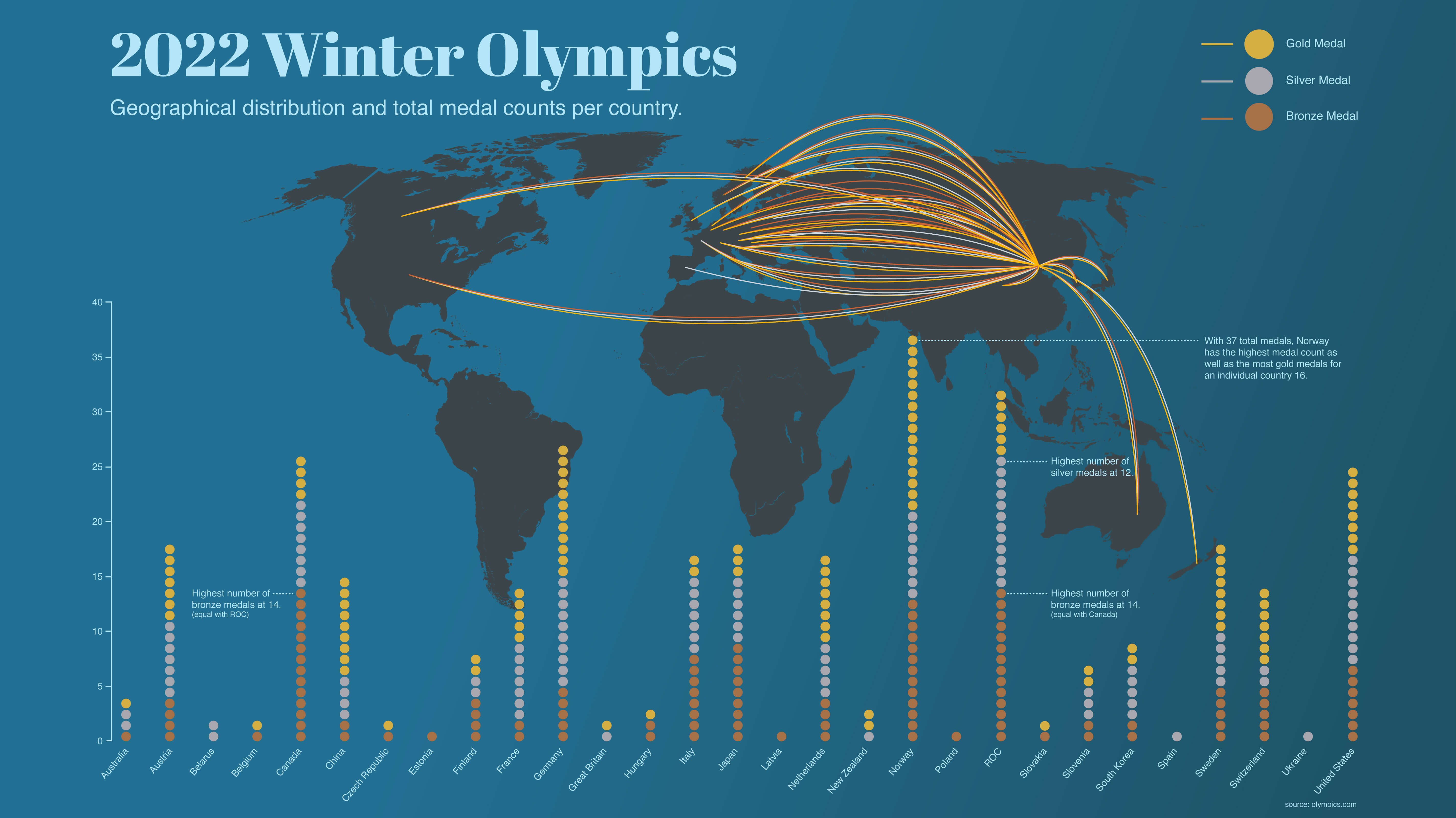
For this project I combined two different graphics to show the medal distribution for participating countries in the 2022 winter olympics - one showing the geographical distribution of medals using a map of the world and the other showing the total number of each medal won by the winning countries.
 Home
Home